Building Twitch Plays Pokemon's Graphics with WebGL
February 12, 2024
As I write this, it's exactly 10 years since the first launch of Twitch Plays Pokemon. The stream has been running for over a decade now! As part of the team behind it, in 2016, I built this piece of animated generative art:
You can see this in the background of Twitch Plays Pokemon during most of the year, when the stream pits its chat against itself in competitive matches of Pokemon Battle Revolution. In this article, I'll explain how I made this background, why I made it, and some context around what Twitch Plays Pokemon has done since 2014.
Setting the Stage
The year was 2015. Twitch Plays Pokemon had successfully completed not just one, but five games of Pokemon by harnessing the power of the internet. Thousands of people had all dedicated their time and effort to (mostly) working as hard as possible to becoming a Pokemon master.
Eventually, the stream began to experiment with other forms of chat-controlled interaction. Pokemon Stadium, a game for the N64, was the first pokemon game to see pokemon battle it out in full 3D for the first time. Twitch Plays Pokemon created a chat-controlled version: two teams of 3 pokemon would be displayed, and users could choose to bet virtual money on whatever team they wanted (denoted, of course, in the official Pokemon currency of pokedollars). Then, the AI-controlled players would battle each other with random moves, and the winner would get their bet back.
Playing Pokemon Stadium proved to be incredibly popular with the TPP community, and many fondly remember those days of betting as some of the most fun matches.
Project Revolution
Pokemon Stadium was a lot of fun to play, but it only included the 251 Pokemon from the first two generations of games. Slowly, people began to wonder if it was possible to play the next Stadium-type game in the Pokemon series: Pokemon Battle Revolution. PBR, as we called it, not only included the updated battle mechanics introduced in generations III and IV, but also a grand total of 493 Pokemon (and not to mention some amazing of music). Playing it was sure to be fun!
But because the Wii was a much more advanced console than the N64, there were many problems that stood in the way of making Pokemon Battle Revolution into something the chat could play. The stream overlay, for example, needed to be able to read the game's RAM in order to detect whether a 'mon had fainted or not (in order to allow users to vote which pokemon to send out next), and no RAM-editing functionality existed in Wii emulators. Selecting all pokemon meant it needed a save file with all pokemon ready-to-choose - but PBR's save file format wasn't known. Emulating Wii games was also processor-heavy, and the existing TPP computer hardware wasn't quite up to it.
Streamer publicly stated that if someone was willing to make a system to play Pokemon Battle Revolution, he'd be willing to use it. From there, it was only a matter of time. Eventually, a team of fans, including one by the name of EliteAinax17, assembled under the name of Project Revolution to create just that. After several months, EliteAinax began streaming test matches on a newly-created Twitch account named ProjectRevoTPP (which he later adopted for personal use), and once the software was judged stable enough, the game was handed over to Streamer. On December 1st, 2014, Pokemon Battle Revolution made its Twitch Plays Pokemon debut. PBR still continues to be played today in between mainstream pokemon games.
But as far as asthetics went, PBR was rather plain: Pokemon teams in the center, bettors on the left and right, and a small footer.
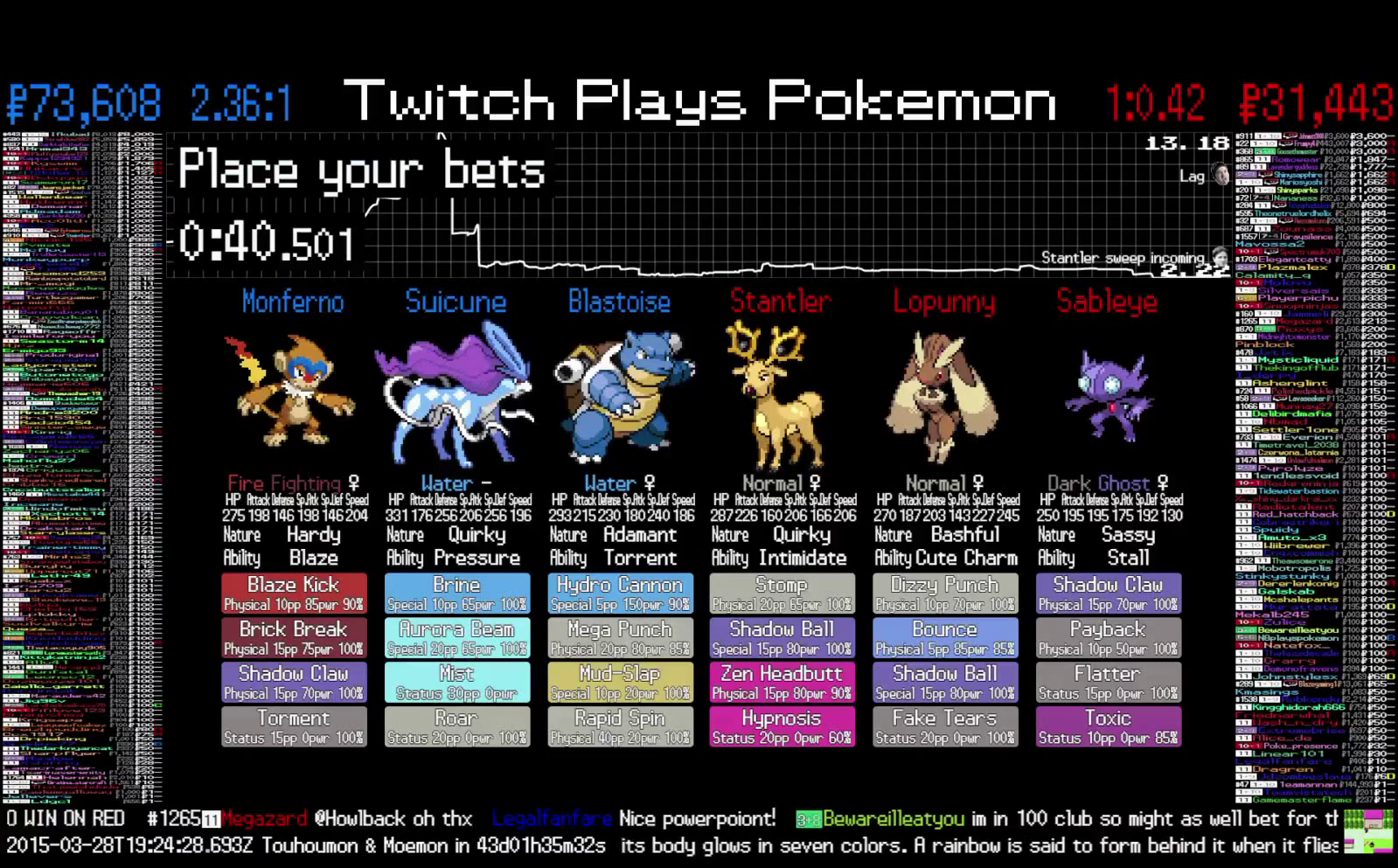
That black background wouldn't last long.
PBR2.0: The Technical Part Of This Article
I first joined the stream as an one-person music team, adding new entries to the list of playable songs. I eventually wrote the code that handles playing music and selecting songs, optimized the advanced AI built for Anniversary Crystal romhack from 30 seconds down to fast enough that we could afford to add another layer to the search tree, helped contribute to the stream interface, made the music selection go haywire for april fools' day, and managed to use a tool from economics in a technical setting to help simplify code.
Sometime after the release of PBR, Streamer began to float the idea of remaking the interface. In addition to lots of balancing changes, and a complete code rewrite, Streamer suggested in the private developer chatroom that it would be nice to have some sort of background to replace the static black; perhaps something based on Pokemon Battle Revolution's own menu background but incorporating user avatars. I decided to give it a try.
Pokemon Battle Revolution's background looked like this: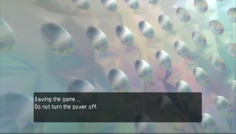
I began by breaking down what I liked about it, to figure out how it worked (and to see it without the pesky text boxes in the way). Dolphin offered a handy free-camera feature, so I loaded up Battle Revolution on my own and attempted to observe what the game's programmers had done. The circles, as it turned out, are in fact not 2D circles, but hemispheres curved away from the camera (perhaps to achieve the 'shiny' look through reflection calculations?). While they appear to drift from the bottom left to the top right, this movement is not as complicated as it looks: from what I could tell, the circles were moving around the surface of a cylinder, and it seemed the camera was tilted. Culling seemed to happen in groups: two side-by-side circles would disappear at the same time once they got outside the camera, and reappear barely offscreen to the left.
I began by creating the orbiting circles. I knew from the beginning that I'd do this in webGL and Three.js, so it was simple enough to make an object to represent one circle, and create enough of them in a cylindrical pattern. I had some convenient pokeball textures lying around from a different project, so I used them to texture each circle:
Then, to match PBR's diagonal slant, I rotated and repositioned the camera until the circles looked like they were arranged diagonally. Doing that was simple enough: I pasted in some keyboard-and-mouse controls so I could interactively move the camera with my keyboard and mouse, flew around the scene until I found a good camera orientation, then logged the camera settings so I could just set them directly at the start of my code.
The circles looked good to me, so I figured it was time to work on the next stage of the background: what came behind the circles.
The Most Painful Way Of Specifying Colors
Behind all the circles, PBR's background has a pretty gradient that appears to be refracting light in a variety of weird, triangular ways. It shimmers over time, too, making for a scintillating display that I'm actually rather disappointed is hidden behind text boxes all the time. How could I get similarly nice gradients that could blend together colors nicely in webGL?
Well, I was working with 3D models. And 3D models can have these nice things called "vertex colors". This, I decided, was the proper way to go.
All one needs to do is specify the color you want each vertex to be in a triangle, and the GPU will do all the blending by linearly interpolating each color together. Great!
However, vertex colors don't come without caveats. As you can see in the above animation, vertex colors do not necessarily have to agree when they meet at a vertex. In fact, the name "vertex" colors is a bit of a misnomer: Because GPUs are designed to operate on triangles, not vertices, one actually must specify one color per "vertex in a triangle". Want your favorite vertex to avoid those ugly lines and show up as only one color? Specify that color once per triangle, and make sure all the colors for that vertex are consistent on every triangle. Normally mesh editing tools will automatically take care of this alignment for you, so you don't need to worry about ugly banding - and normally you'd be texturing a mesh, so you wouldn't even need vertex colors in the first place.
For my first attempt at creating a gradient background, I decided that the best way I could think of was to make a giant cube, then color the corners of that cube different colors by manually entering vertex colors into the triangles that made up the cube. Not the best idea, in retrospect.
  //right face

  geometry.faces[1].vertexColors = [new THREE.Color(0xafcdd0), new THREE.Color(0xd6f0ff), new THREE.Color(0xe1c1b0)]


  //top left face

  geometry.faces[10].vertexColors = [new THREE.Color(0xe1c1b0), new THREE.Color(0xd6f0ff), new THREE.Color(0x7a8f91)]


  //bottom triangle face

  geometry.faces[11].vertexColors = [new THREE.Color(0xd6f0ff), new THREE.Color(0xd6f0ff), new THREE.Color(0x7a8f91)]
That produced a background that looked like this:
It wasn't bad! But then I took another look at PBR's background:

Behind those circles, the background isn't just a static gradient. There's a hexagon of colors shimmering in a regular pattern. Each hexagon is made of many triangles, and over time colors would slowly flow out of the center of one triangle to the inside of its neighbors. I wanted to try and replicate that color changing in my design.
Scintillating Shaders
I got to work. I constructed a plane in code, and marked every other vertex with a blue vertex color. That looked like this:
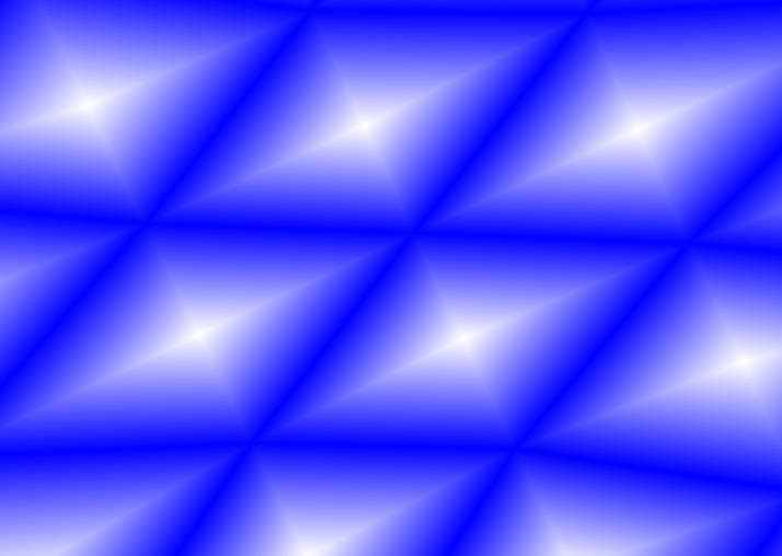
Next, I needed to make vertex colors change over time. That meant making a formula that dictated a vertex's color for a given input value, and if I wanted to do that for many vertex colors all at once, I'd probably need to start thinking about shaders.
As opposed to most programs which run on a computer's CPU, shaders are programs designed to run many times in parallel using a GPU. In my case, using webGL to render graphics, there are two types of shaders: vertex shaders, which run a formula once per vertex to compute colors or change vertex positions, and fragment shaders, which run once per pixel to decide how to color that pixel. The vertex shader can pass values to the fragment shader, including vertex colors, but those vertex colors will be blended: a point halfway between a green vertex and blue vertex will automatically get a vertex color of 0.5*green + 0.5*blue. Fragment shaders do that blending automatically!
To get some pulsing, I wrote a function which interpolated between two different colors, made it repeat by having the interpolation factor move back and forth in a sine-wave pattern, and then used the blue color as a signal for some vertices to be slightly ahead of other vertices. I'd need to pass in a number representing the current time, but that was simple enough using shader uniforms. Here was my first attempt at coding this via shaders:
var vShader = [

  "varying vec3 vNormal;",

  "varying vec3 vPosition;",

  "varying vec2 vuv;",

  "varying vec3 vcolor;",

  "uniform float time;",

  "vec3 getcolor(float time){",

    "float lerpfrac = clamp(sin(time),0.0,1.0);",

    "return vec3(0.68,0.80,0.81) * lerpfrac + vec3(0.88,0.75,0.69) * (1.0-lerpfrac);",

  "}",


  "void main() {",

        "vcolor = getcolor(time + color.r);",

    "vPosition = position.xyz;",

    "vNormal = normal.xyz;",

      "gl_Position = projectionMatrix *",

                "modelViewMatrix *",

                "vec4(position,1.0);",

  "}"].join("\n")


  var fShader = [

  "varying vec3 vNormal;",

  "varying vec3 vPosition;",

  "varying vec2 vuv;",

  "varying vec3 vcolor;",

  "uniform float time;",

  "void main(){",

  "  gl_FragColor = vec4(vcolor.rgb, 1.0);",

  "}"].join("\n")


  var uniforms = {

    time: {

      type: 'f',

      value: 0,

    }

  };


  var colorfulbox =  new THREE.Mesh(

    geometry,

    new THREE.ShaderMaterial({

      side: THREE.BackSide,

      vertexShader: vShader,

      fragmentShader: fShader,

      vertexColors: THREE.VertexColors,

      uniforms: uniforms,

      })

    );


  colorfulbox.uniforms = uniforms;
That effect looked like this:
Hm. Not the best. There are times when the full screen is the same color, and it's not very hexagonal.
Version 2: Triangle Time
To improve on that, I constructed a 3D model in the software blender to help me with this. I painted the vertex colors blue if the colors should flow outwards in that triangle and black if they should flow inwards.
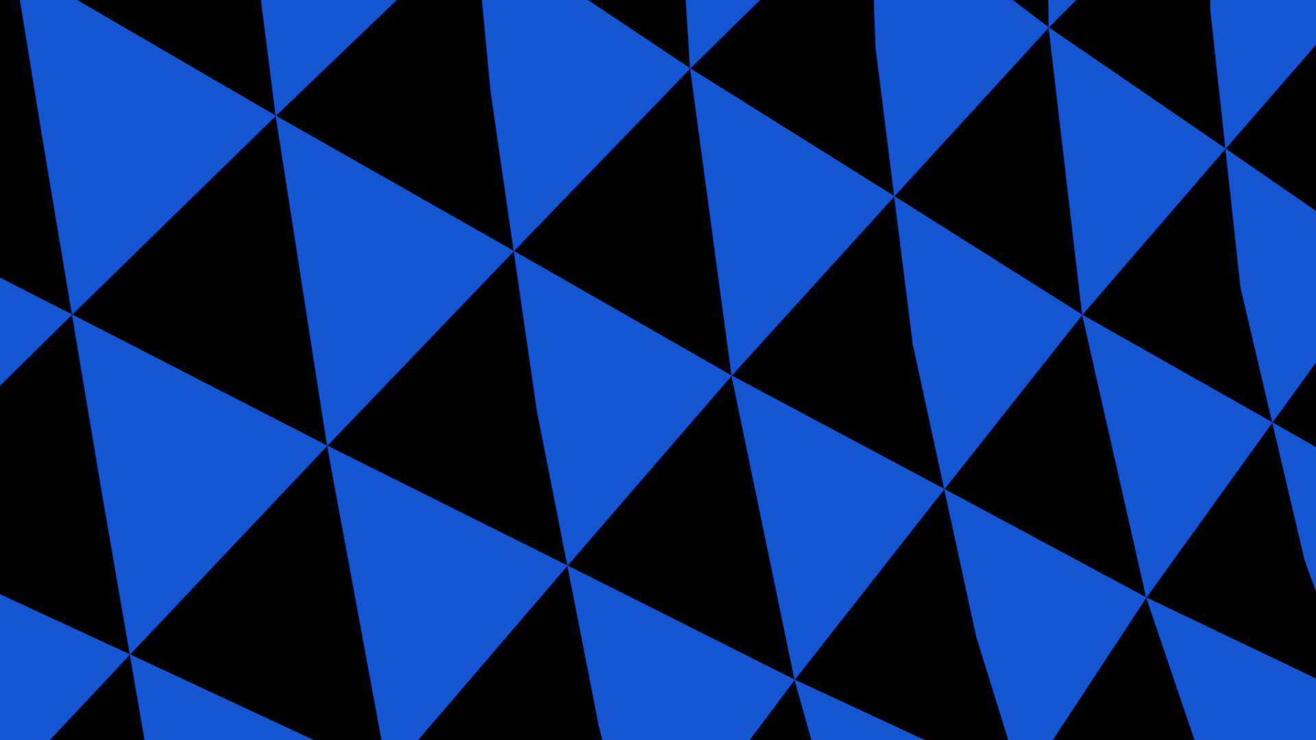
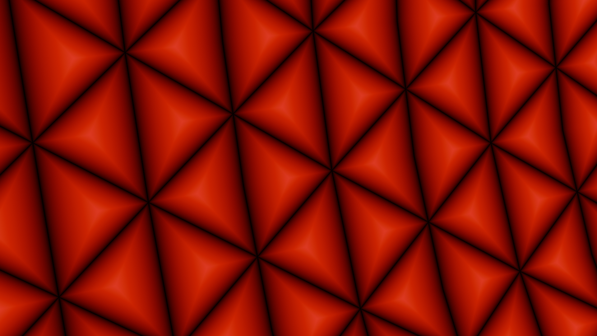
Notice the vertex in the center of the big triangle - those big triangles are actually made of 3 smaller triangles!
Finally, I can combine the blue and red values into the final model, which looks like this:
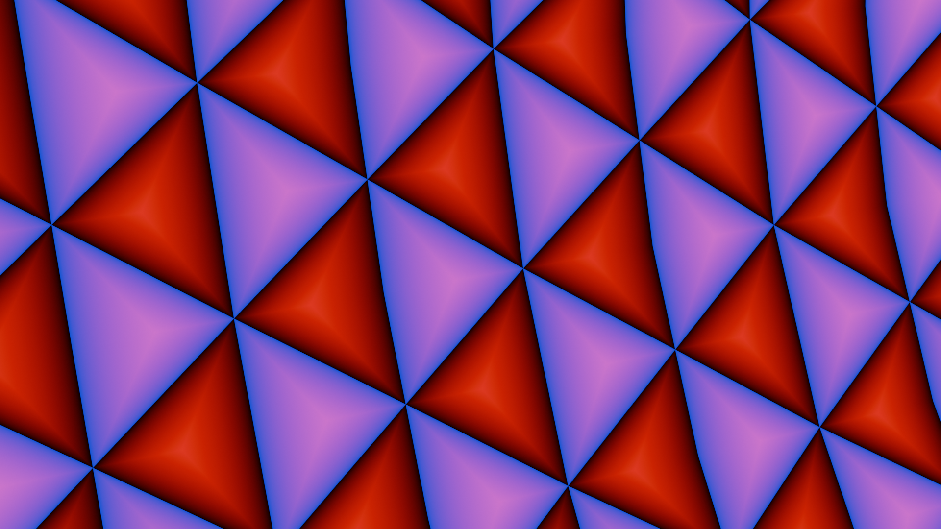
This cylinder is what you're looking at in the final version - but shaders reinterpret those colors as inputs.
Next, I selected six colors by color-picking the original background from PBR:
vec3 getcolor(float time){

    float colorindex = mod(floor(time + 0.5),6.0);

    if(colorindex < 1.0){

      return vec3(0.65, 0.70, 0.71);

    }else if(colorindex < 2.0){

      return vec3(0.56, 0.59, 0.64);

    }else if(colorindex < 3.0){

      return vec3(0.59, 0.55, 0.64);

    }else if(colorindex < 4.0){

      return vec3(0.51, 0.63, 0.64);

    }else if(colorindex < 5.0){

      return vec3(0.52, 0.61, 0.60); //colorpicked, may in fact be just a transition of surrounding two and not an actual color

    }else if(colorindex < 6.0){

      return vec3(0.65, 0.71, 0.65);

    }

    //return a default color to satisfy chrome

    return vec3(0.71, 0.60, 0.58);

  }
Then, using the red vertex colors from the model, I adjust the input to that function - a red vertex color is slightly ahead in time, and a blue and red vertex color means it's slightly behind in time. The final result: bands of color! For the final touch, the cylinder rotates slowly.
  //helper function whose graph is supposed to look like:

  //   _/

  //  /

  //Used to help smooth out the transition between outward and inward triangles

  float rampwaitramp(float x, float waitsize){

    return step(0.0,x-waitsize)*(x-waitsize) + step(0.0,-x-waitsize)*(x+waitsize);

  }


  void main(){

      float isOutwardstri = (vcolor.b*2.0-1.0); //1.0 if the triangle is going outwards, lerps to -1.0 if not, 0.0 at edges

      gl_FragColor = vec4(getcolor(rampwaitramp(vcolor.r * isOutwardstri * 2.0,-0.1) + time/2.0),1.0);

  }
Finally, I added a transparent rectangle in front of the background to add a slight color gradient from one corner to another. In the end, it looks like this:
That background is what made it into the stream, and is still used today whenever Twitch Plays Pokemon plays Pokemon Battle Revolution, although there's a gray tint over it for better text contrast. It's shiny and serves no purpose other than to look cool, and I'm very happy with it.
There's one more special touch: Twitch has an API to see all users in chat - so instead of just displaying circles with pokeballs, on-stream the circles display the avatars of users currently in chat. Felk (another dev) wrote some code to read the list of people in chat and pull those avatars via twitch API, which are then fed to this background.
I experimented with putting nametags below each circle to show the user's username, but that ended up being too slow! I needed to render each piece of text individually, and my strategy of rendering to a canvas and then downloading that canvas as a texture was too slow. I tried pre-creating those canvases so I could render multiple simultaneously, but those still took up too much time. In the end I abandoned the nametags and just left the circular avatars.
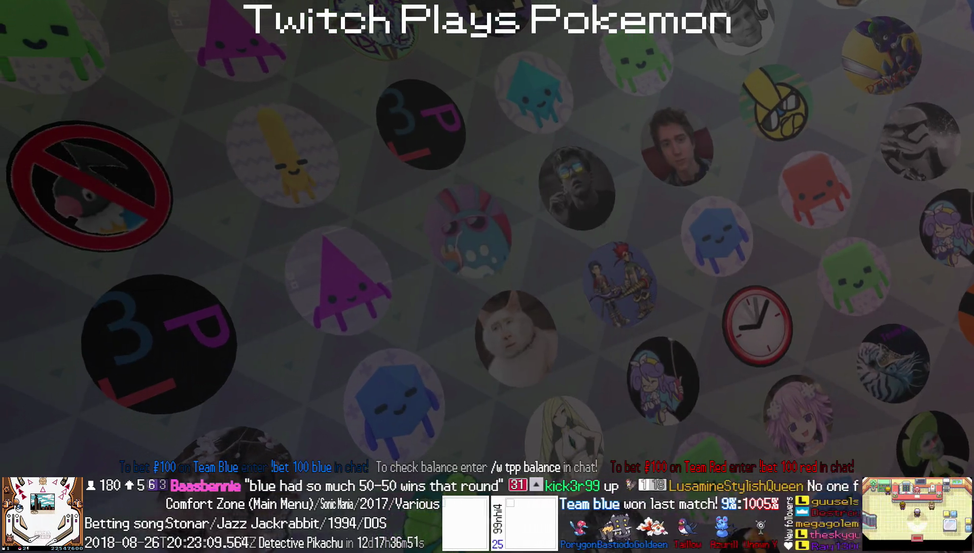
Looking back, my background doesn't quite look exactly like my inspiration. PBR didn't have concentric triangles - instead, their animated effect involved some crazy refractions in a more hexagonal grid as opposed to my triangular one. It's interesting to see the differences after coming back to this after a few years.
This was the only part of the PBR2.0 overlay I was involved with. In retrospect, the overlay itself has a few flaws - it's very visually cluttered, the bottom bar takes up lots of screen real estate, the text is unreadable on mobile, overflowing text shrinks horizontally instead of overflowing... but none of that was my problem!
And Time Marched On
TPP kept going, playing romhacks and new games as they came out, although with only a few hundred viewers nowadays. The original streamer (still anonymous and going by "Streamer") after some egregious behavior was convinced to retire around 2017 and gave the stream hardware to m4_used_rollout, who now runs the stream. I retired from the Twitch Plays Pokemon development team in 2018. Pokemon Omega Ruby / Alpha Sapphire added some paintings of Omanyte and referenced a helix fossil in the French translation.
It's been a long decade, and I'd like to think ideas from Twitch Plays Pokemon have diffused into broader gaming culture. Some twitch streamers like Dougdoug code new "twitch plays" gimmicks regularly. Blaseball made chaotically affecting a game as part of a large crowd a core mechanic (and then smoldered and died a slow boring death). Maybe TPP helped popularize the idea of watching a video game via livestream, so developers began thinking about how to make games that are great spectator sports, which eventually led to the popularity of Fortnite and Among Us.
At the same time, not all effects are good. TPP was full of users being contrarian and hurting progress because they thought it was funny. I see echoes of that in gamergate's harassment mobs and today's incel culture and white supremacists. Twitch's PogChamp emote was replaced after the original actor became a conspiracy nut, vaccine denialist, and U.S. Capitol insurrection supporter. A pandemic which hasn't ended forced us all to connect and find communities online, and by that time being a member of a livestream chat was almost normal.
And eventually, I took the webGL skills I developed working for TPP and began making interactive math explanations, which you can see on this very site.
Thanks for reading! If you want to share any Twitch Plays Pokemon memories or get notified about new articles, contact me at explanaria@ail.com.